Urbantiger
Redesigning an online clothing store
Urbantiger is a Russian premium clothing brand that makes most of its collections from sustainable materials. I was the senior designer on the full redesign of its online store, urbantiger.ru. (The live store is in Russian. The screens here are translated.)
The old store went up in a rush in 2021. A round of UX fixes in 2022 lifted conversion, and after 2023 nobody touched it again. The site no longer matched the brand, and people had few reasons to come back.
The brief was big: 28 pages, four breakpoints, a design system, loyalty and gift cards. We had three months. The goal was a store that’s easy to buy from and still looks premium.
- Role
- Senior designer
- Team
- Client’s product strategist and head of the online store · studio’s design lead, two junior designers and an illustrator
- Timeline
- Three months of design, handed over in July 2025
- Outcome
- MVP live · conversion at about twice the old site’s rate, as the client reported
Urbantiger was a client of Cedro Agency, the studio I worked at. We won the tender for the design, and another team built it.
Turn the brief into a plan
The client’s product strategist wrote the brief himself: every page, every block, with references. He used to work at Only Me, a store I’d designed before, and almost half of his references were my old screens. The brief also said we could change anything, as long as we could argue for it.
Before any visuals we went through stores like Urbantiger, from 12 Storeez and Monochrome to Moncler and Stone Island. We stole the wishlist idea from Zara, then checked how marketplaces run theirs. The gift card flow came from Zolotoe Yabloko, a Russian beauty chain. Then I mapped the whole store as one flow and built clickable prototypes, so we could argue about structure while it was still cheap to change.
With the design lead I made three directions for the home page: eco, tech and fashion. A fourth grew out of those three and became the final design.
Make buying shorter
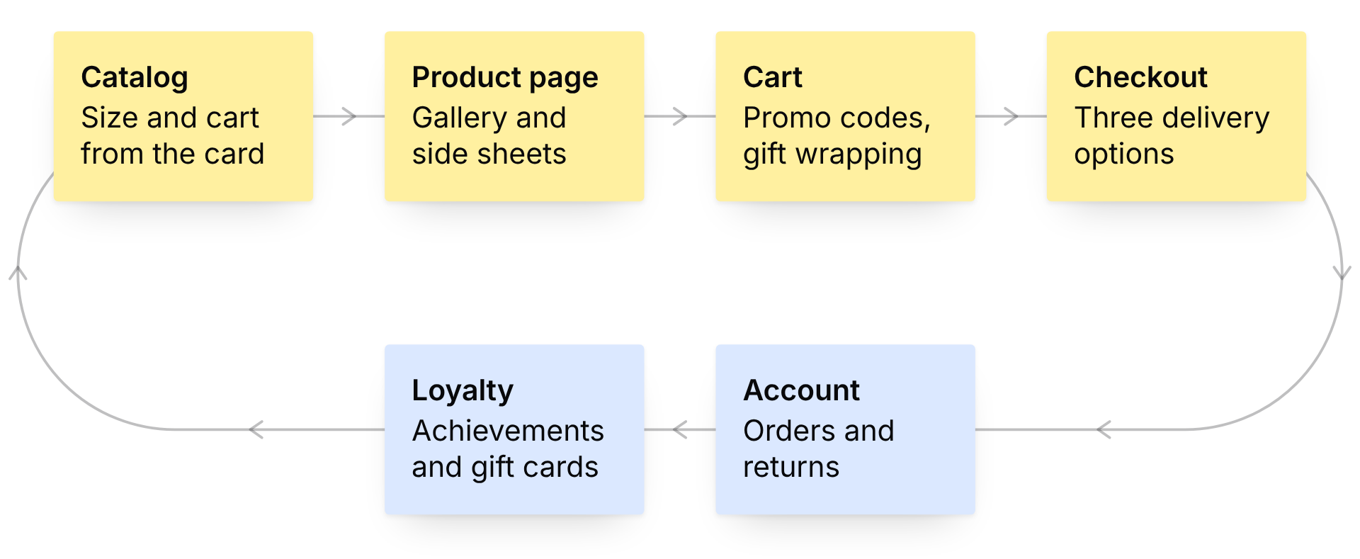
Most of the money goes through four screens: catalog, product page, cart and checkout.
- Catalog. Pick a size and add to cart right from the product card, so you don’t lose your place in the catalog. If your size is sold out, ask for a restock alert. Filter by fabric, from linen to recycled polyester.
- Product page. A gallery with zoom, stock hints like “only a few left”, and details tucked into side sheets, so the page stays short.
- Cart. Related products, promo codes and gift wrapping in one place. A quick cart opens from any page.
- Checkout. Three delivery options, and each says plainly what you get. Store pickup comes with a fitting room. Pay by card, on delivery or in installments.
Answer the developers’ questions in advance
Another team was going to build the store, and we wouldn’t be in the room when they had questions. So the mockups had to answer them in advance, including what happens when things go wrong:
- Signing in by phone, confirmed through Telegram, VK or a call.
- Promo code and bonus errors, each with its own message.
- Restock alerts for sizes that sold out.
- Empty cart, wishlist and alerts. The empty cart suggests products instead of just saying it’s empty.
- Changing an email or phone number.
- Returns in six steps. The old returns were hard to start, couldn’t be tracked, and you printed the forms yourself. Pick an exchange instead of a refund and you get an extra 10% off: the customer gets a deal, and the money stays in the store.
Everything sits on one UI kit, so 28 pages at four breakpoints stay consistent. I worked on it with two junior designers and an illustrator.
Give people a reason to come back
The brief asked for a loyalty program. We designed three parts of it:
- Achievements. Badges for purchases, eco choices and activity, in silver, gold and platinum. Night Owl is for shopping at night, Trendsetter for buying from a new collection in its first week. Each badge gives bonus points or a gift. The illustrator drew them, and I set the direction.
- Gift cards. Pick a design, set the amount, add a greeting. The recipient opens it like an envelope, because a gift should feel like one.
- Wishlist collections. Group saved items and share a collection by link, for the friend who always asks what you want for your birthday.
Where it landed
MVP
Live: catalog, product page, cart, checkout and account. The client reported conversion at about twice the old site’s rate, while traffic fell 30 to 40% over the same period.
Loyalty
Achievements, gift cards and wishlist collections were designed and handed to development. They hadn’t launched when I left the studio in January 2026.